Ruvo Transportation App
Simplifying Expense Chaos with a One-Tap Fund Request System
Overview
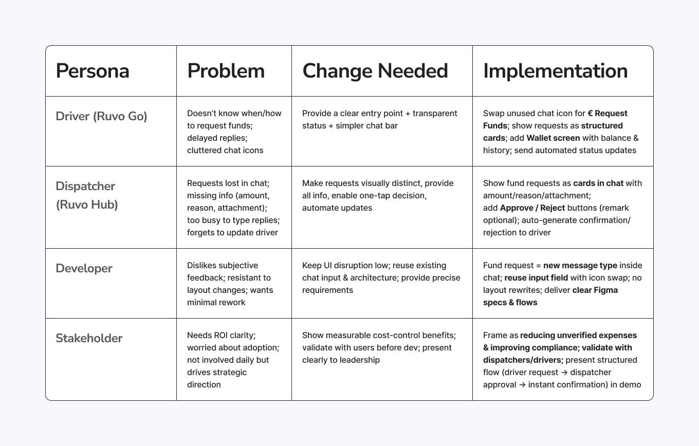
I designed a fund request feature for a European transport company's driver and dispatcher applications. The goal was to allow truck drivers to request specific amounts for upcoming road expenses - reducing the company's unverified spending while improving clarity and communication between drivers and dispatchers.
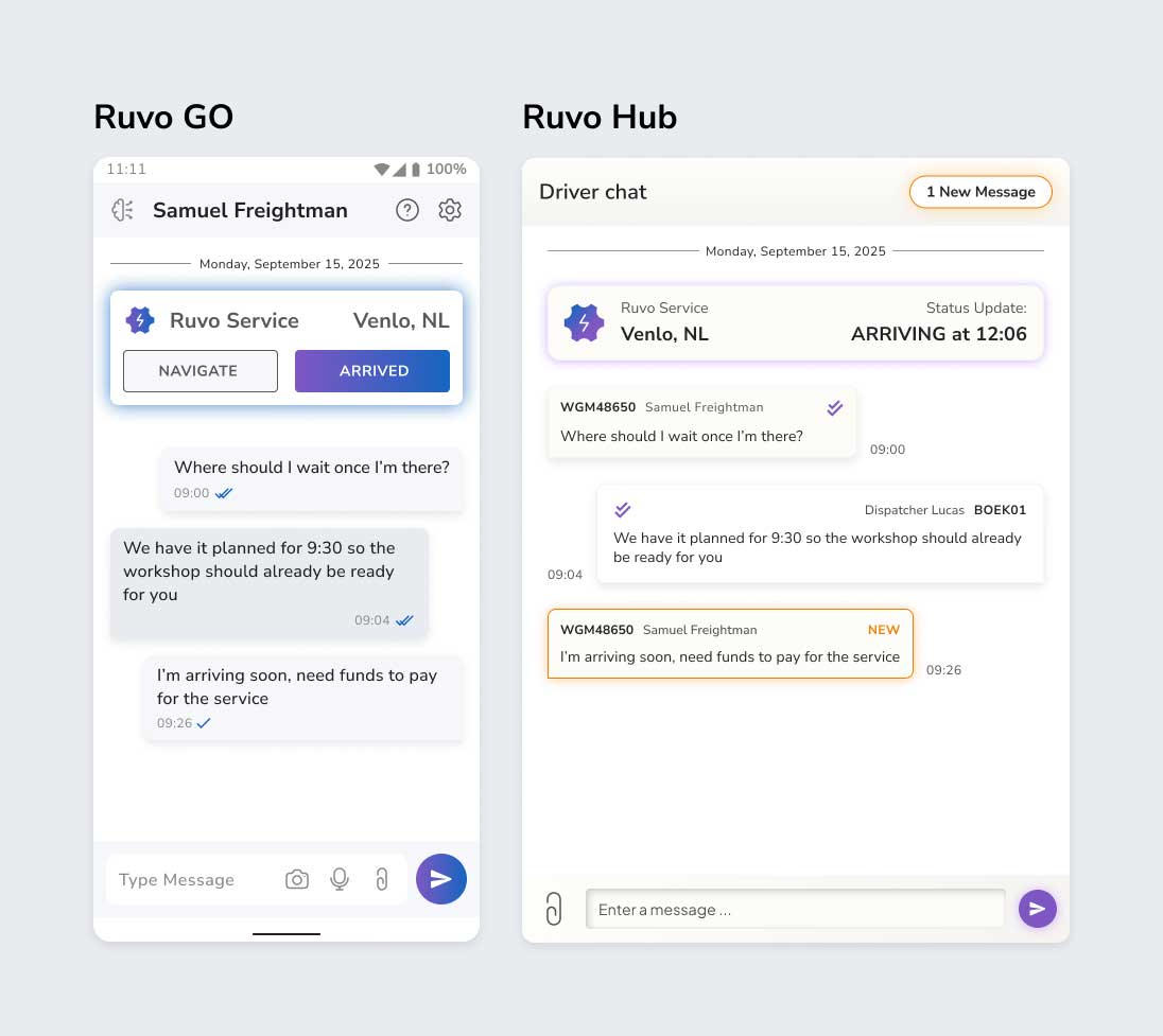
Ruvo Go & Hub - Before Redesign
The Challenge
Currently, drivers receive a monthly lump-sum allowance loaded onto their payment cards.
This system led to unverified expenses, limited control, and frustration on both sides:
- Drivers didn’t know when or how to request top-ups.
- Dispatchers missed or delayed approvals buried in chat messages.
- Finance had no clear audit trail for where money went.
My task was to design a fund request component for both apps
- Ruvo Go (driver) and Ruvo Hub (dispatcher) - that fits within the existing chat-based system, using the provided design system and handed off for development within two weeks.
Understanding the Users
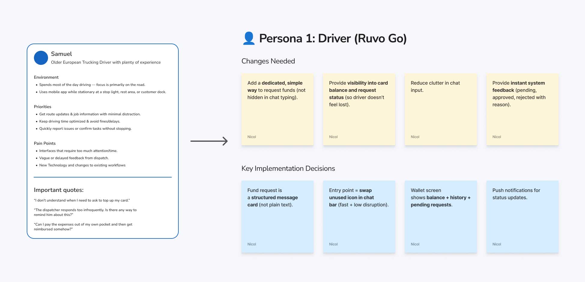
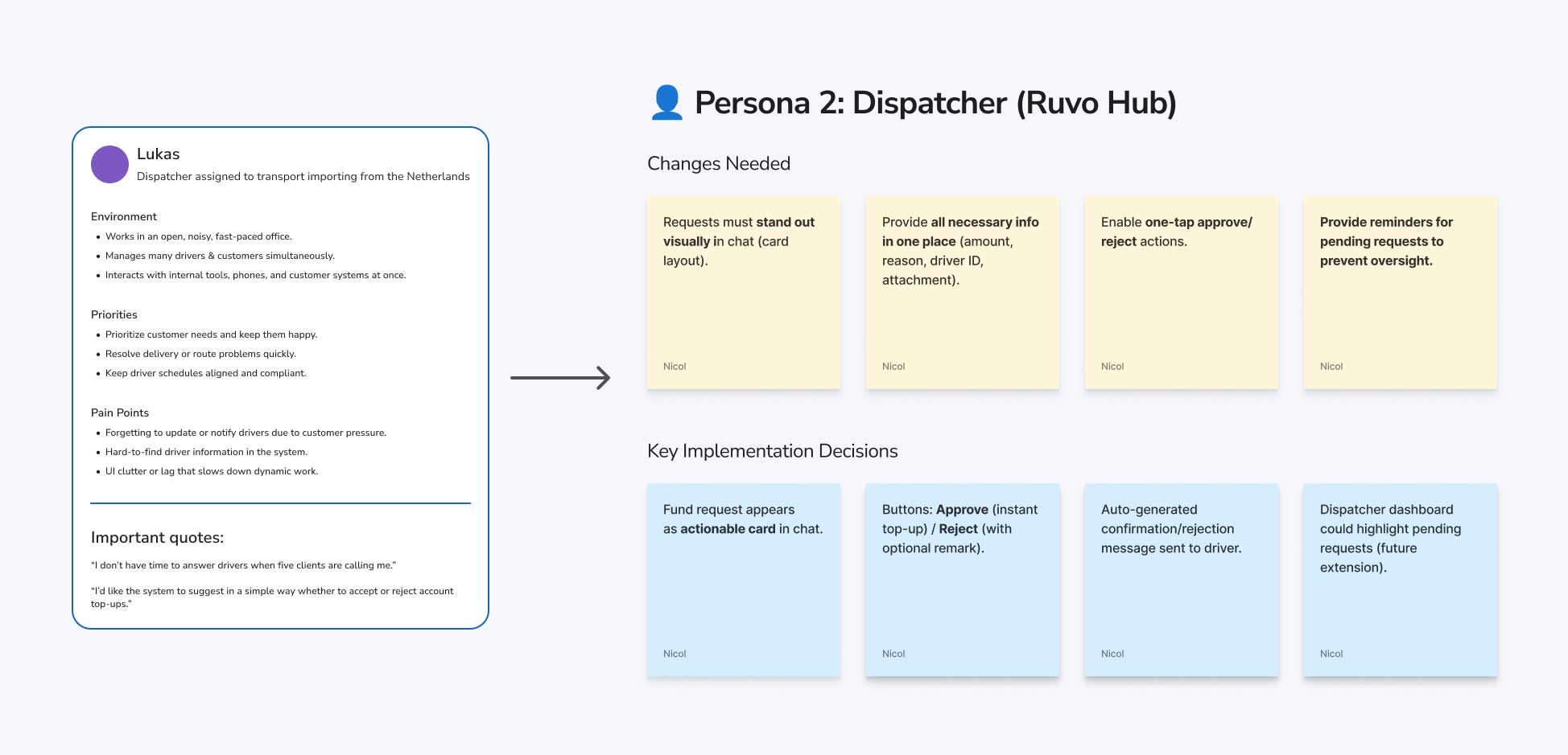
I started by analyzing the four provided personas, each representing a core stakeholder group in the system.
User Personas
Cross-Persona Alignment
- Driver and Dispatcher both work in chat → fund request must live inside chat, not as a separate tool.
- Driver needs clarity, Dispatcher needs speed → solved by a structured fund request card that contains all info + action buttons.
- Minimize dev effort → reuse chat as container, swap existing icons, avoid big navigation changes.
Bussiness Personas
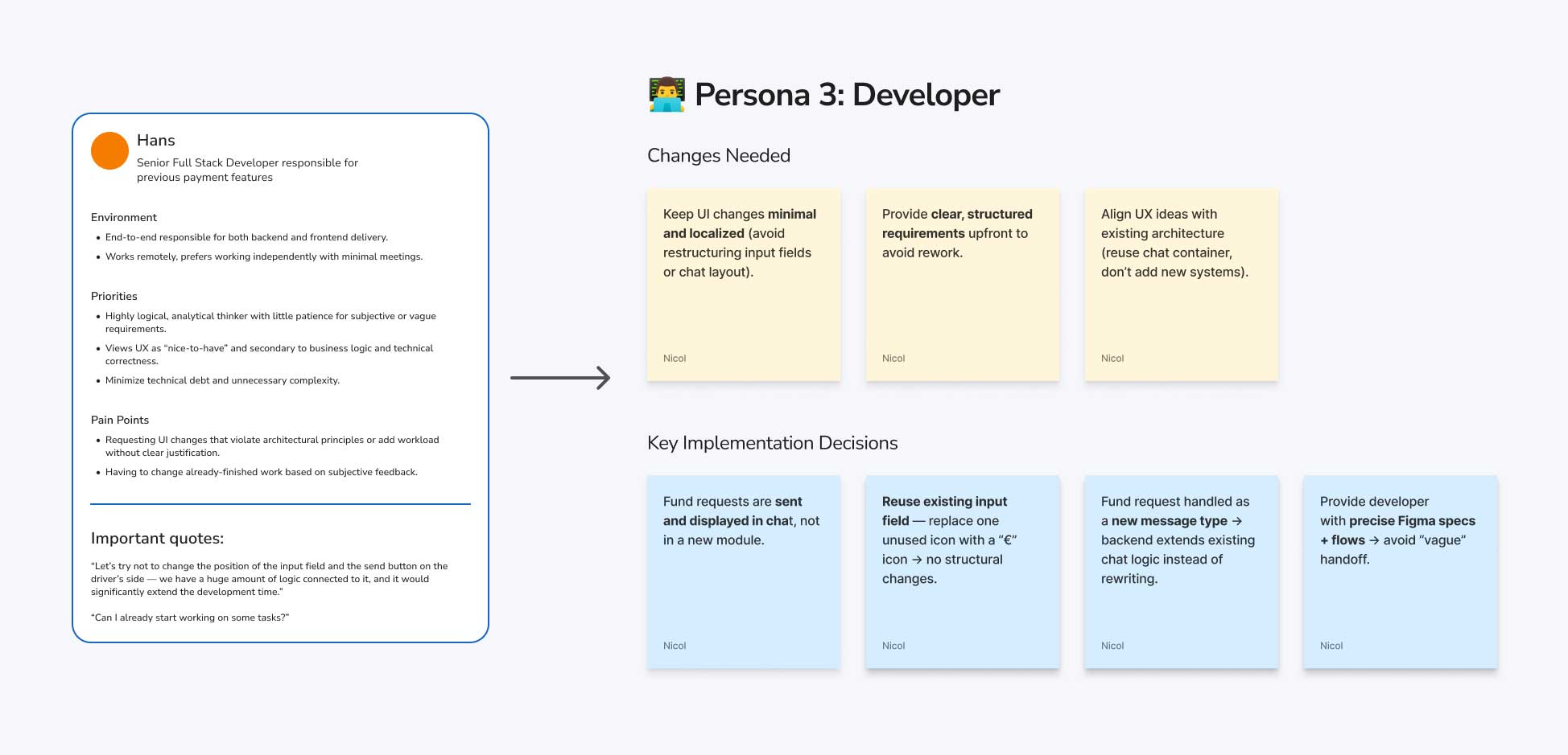
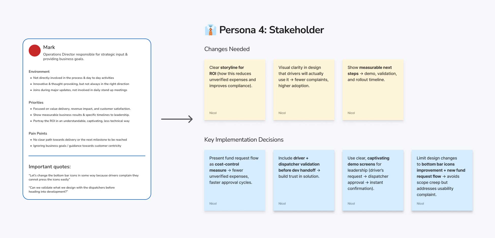
Insight
- Developer wants low-friction implementation.
- Stakeholder wants clear ROI and confidence that drivers/dispatchers will adopt it.
- Together this means: 👉 Minimal UI disruption + strong business storytelling.
Collective Insights
Analyzing the System
Before jumping into design, I examined how fund requests currently flow through the system - and quickly discovered several gaps. It wasn’t clear how drivers actually request money (chat messages or a structured process), how dispatchers approve it, or how those approvals connect to card loading. The interface also seemed cluttered with unused chat icons, and there was no clear way to track or audit decisions.

From the user perspective, both roles lacked visibility: drivers couldn’t easily check balances or request statuses, and dispatchers had little context for fast, informed approvals.
These uncertainties highlighted a common real-world challenge: designing with incomplete data. I made informed assumptions to move forward while building in flexibility for future iterations.
Exploration
Problem
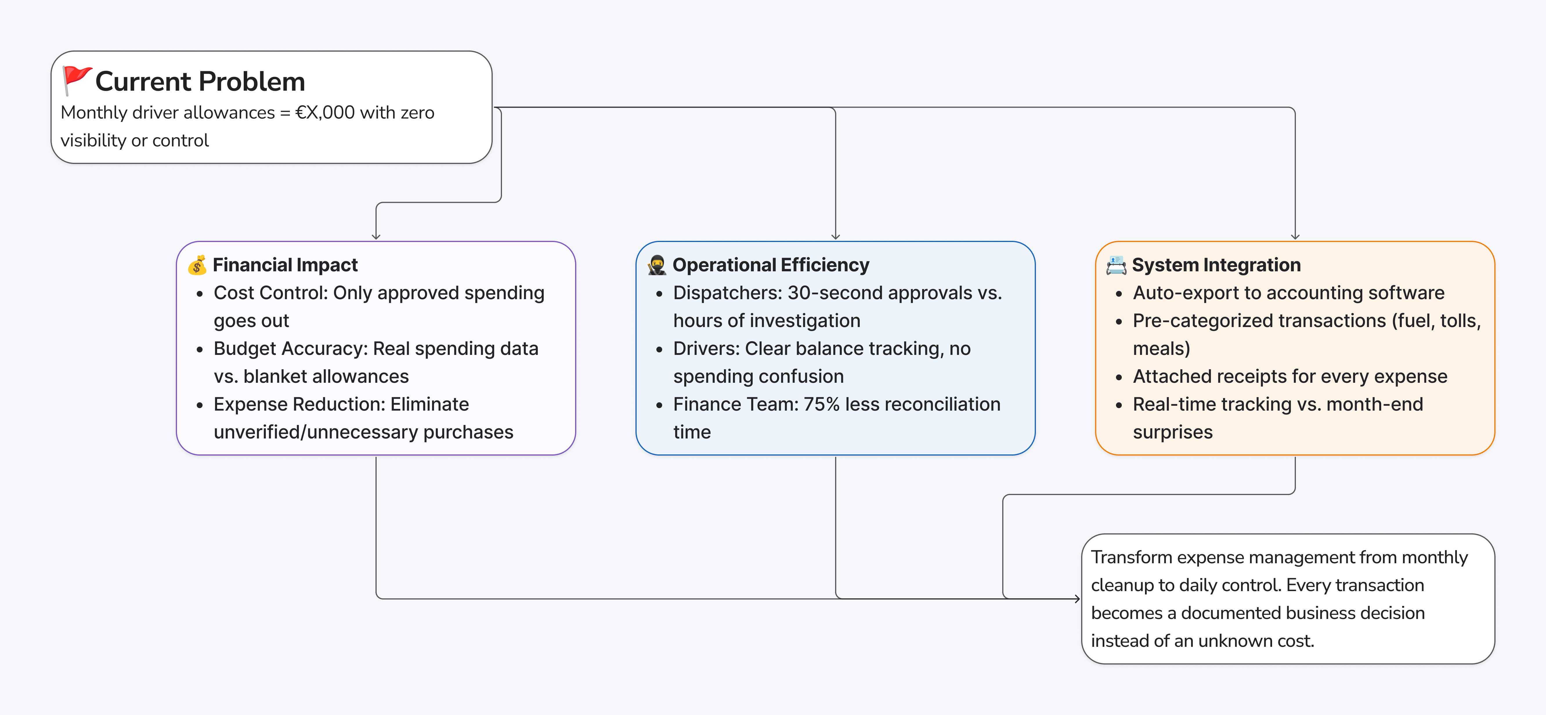
The current monthly fund-loading process leads to unverified expenses and operational inefficiencies. Drivers lack clarity on when and how to request funds, while dispatchers struggle with text-based requests buried in chat - missing critical context for approval decisions. This results in delays, frustrated drivers, forgotten approvals, and poor expense tracking.
- ❌ No clear request process or status visibility
- ❌ Requests lost in chat, missing context
- ❌ Must minimize technical changes while ensuring ROI
Solution Approach
Introduce a structured Fund Request System integrated into the existing chat infrastructure.
For Drivers:
One-tap request → structured form → real-time status tracking
For Dispatchers:
One-tap Approve or Reject with remark → automated message to driver.
Design Principles
- Minimal disruption: new message type within existing chat system
- Contextual clarity: all decision-making info structured
- Status transparency: clear feedback loop
- Technical alignment: uses existing components
Expected Outcomes:
Reduced unverified expenses, faster approval cycles, improved driver satisfaction, and streamlined dispatcher workflow.
Design Exploration: Entry Points
1. Inside Chat Input
Quick “€” icon next to attachment → opens modal form (amount, reason, attachment).
✅ Minimal flow change • ❌ Can be overlooked behind icons.
2. Quick Action in Header
Visible “Request Funds” button in top bar → opens same form.
✅ Highly visible • ❌ Slight header clutter.
3. From Wallet/Balance Screen
Request directly from Funds screen, still posts to chat.
✅ Logical for money tracking • ❌ Extra navigation step.
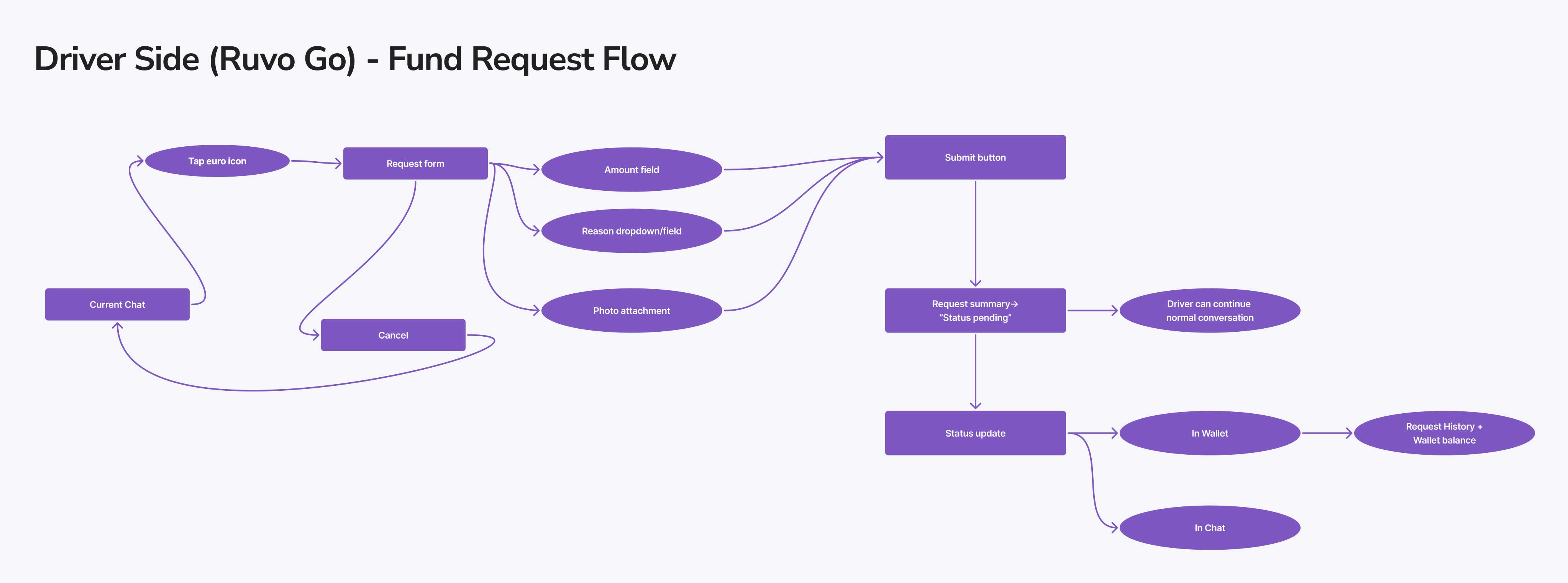
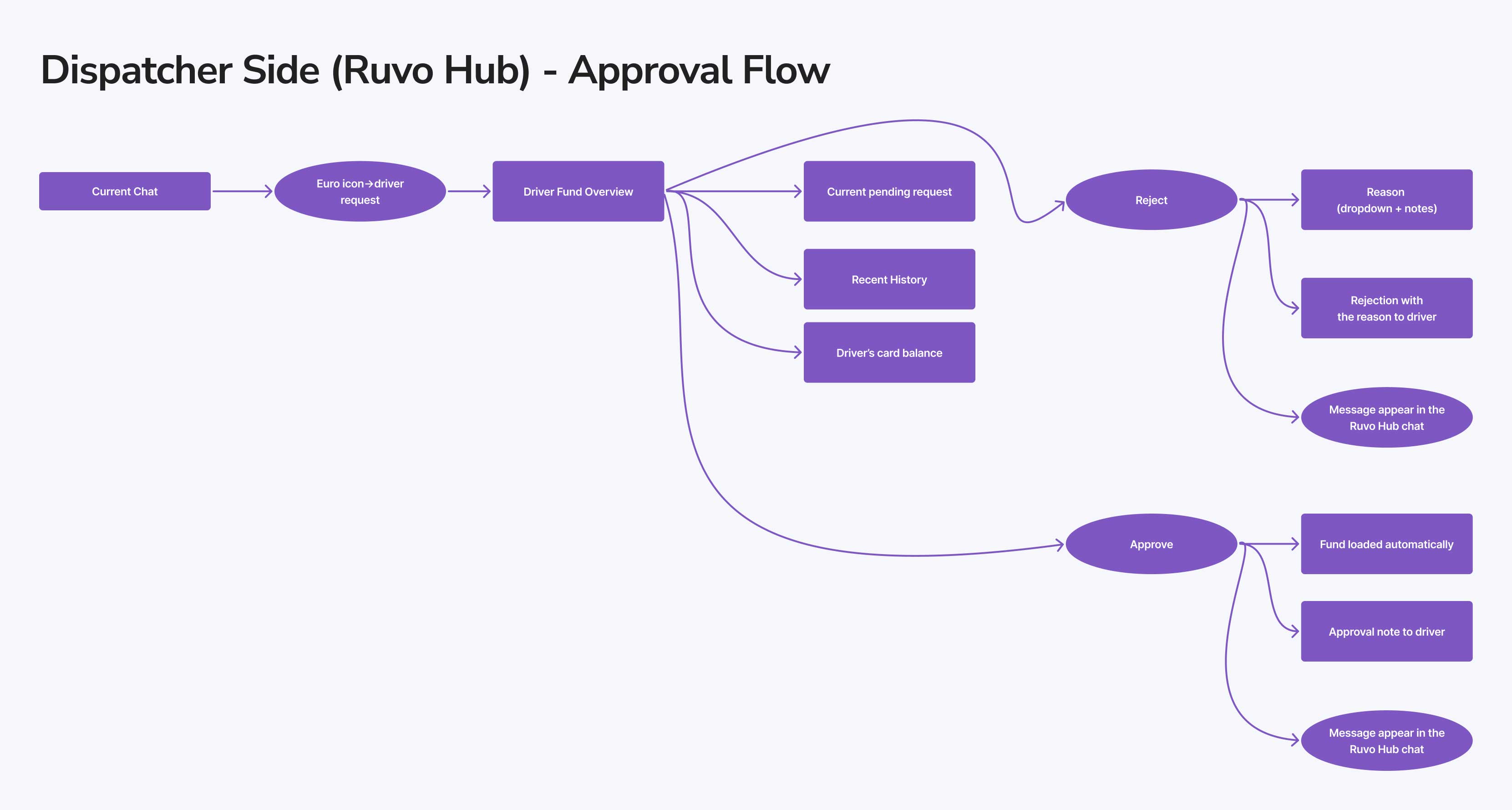
User Flows and Early Wireframes
To ensure a smooth experience for both drivers and dispatchers, I mapped out key flows before moving into detailed design. These early wireframes helped validate the interaction logic and information architecture quickly.
User Flows
AI wireframes
View the complete research documentation and design exploration:
📎 Full research fileFinal Solution
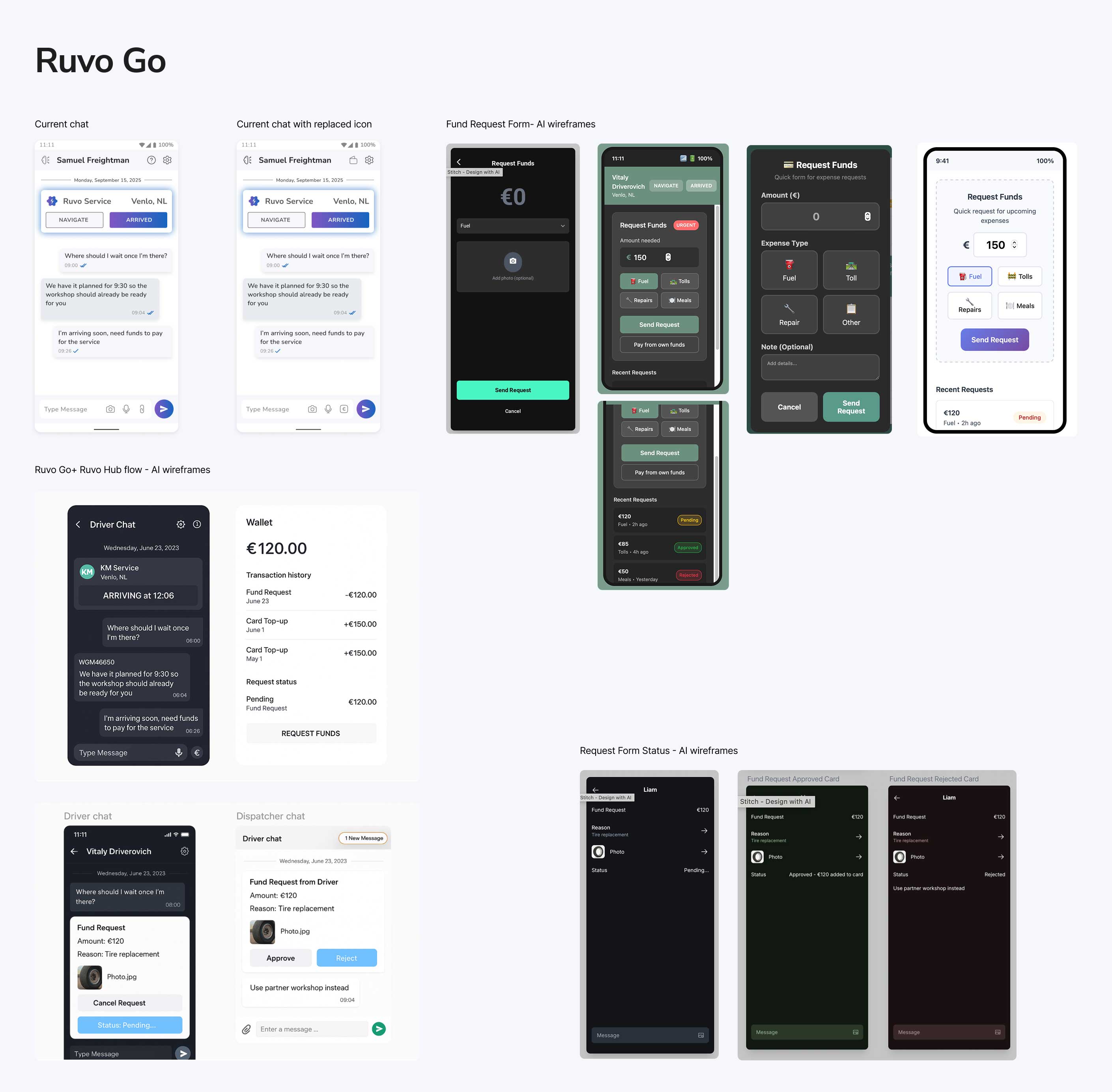
Ruvo Go (Driver)
I designed a lightweight, in-chat fund request flow that gives drivers clarity and minimal distraction.
1. Icon updates (low-impact change)
- Attachment → € (quick fund request)
- Question mark → Wallet (balance & history)
2. Fund request form (modal)
- Fields: Amount (required), Reason (dropdown with “Other” free-text)
- Optional: Photo attachment (receipt / proof)
- Post-submission: Structured request card is posted to chat and the driver sees “Request sent - pending approval.”
3. Wallet screen
- Balance overview at top
- Pending requests (count + quick status)
- Request history with timestamps and final statuses (approved / rejected)
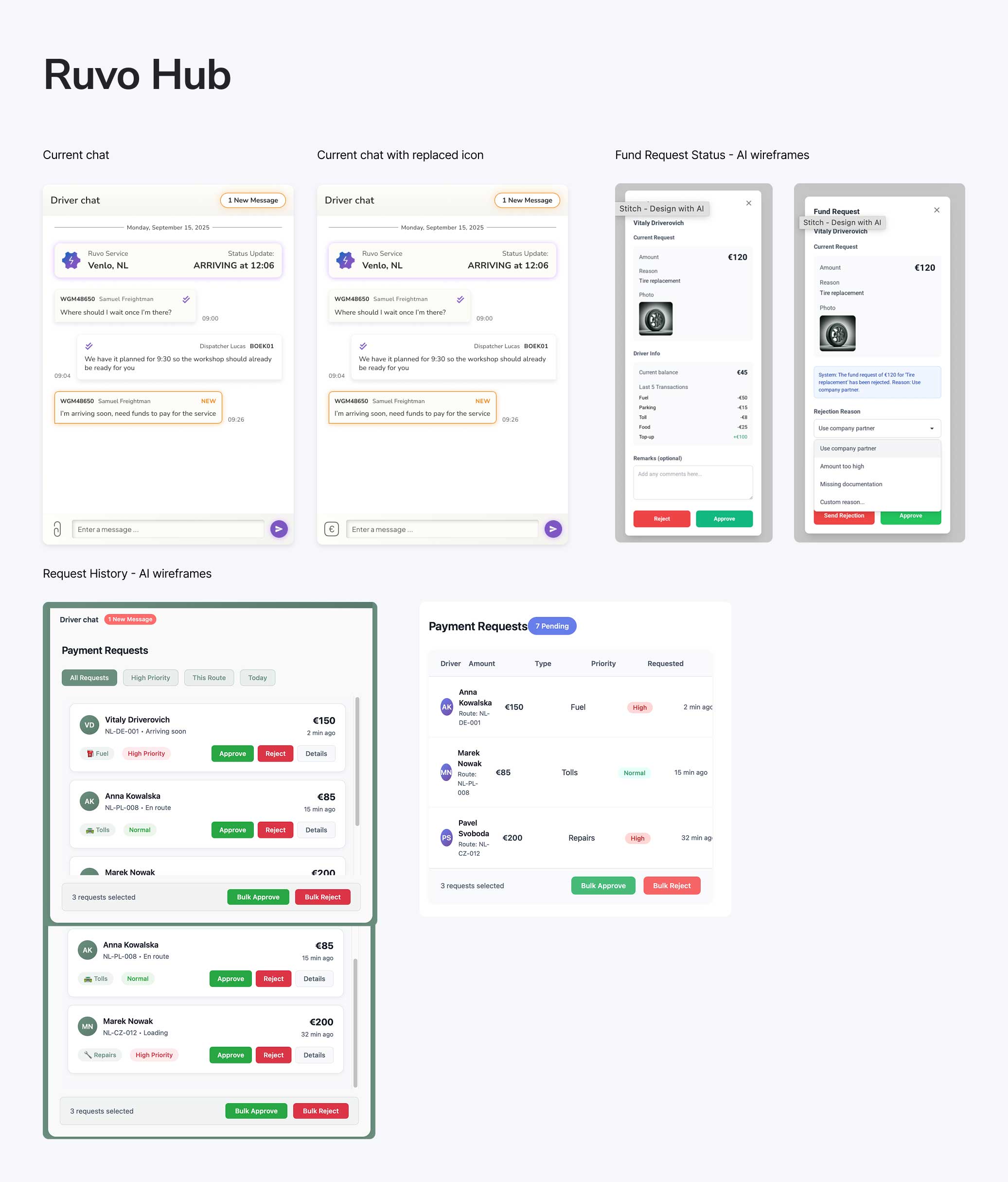
Ruvo Hub (Dispatcher)
Dispatchers receive context-rich, actionable cards inside their existing chat to make fast, confident decisions.
1. Actionable request card (in chat)
- Displays: Driver name / ID, amount, reason, optional photo preview
2. Decision controls
- Approve - instant top-up
- Reject - optional short remark (auto-sent to driver)
3. Automation and future extension
- Approve/reject triggers an auto-generated confirmation message to the driver.
- Future extension: Dashboard highlight for pending requests and queue prioritization.
Access the full design file with all screens, components, and specifications:
👀 Explore in FigmaExpected Outcomes
The redesigned fund request system aims to bring financial transparency, operational efficiency, and stronger system integration to Ruvo’s daily operations.
Implementation Considerations
During handoff, I documented open questions and technical edge cases to help developers and stakeholders anticipate challenges early. These notes ensured smooth collaboration and realistic expectations for the next phase.
Here are the four main areas we identified for further exploration:
Technical Feasibility
- What happens if the payment system goes down?
- How do we prevent duplicate requests while one is pending?
Edge
Cases
- How should the system behave when a dispatcher is offline for hours?
- What about simultaneous requests from multiple drivers?
Business Logic
- Are there spending limits or approval thresholds per driver?
- How does this connect with audit trails and accounting systems?
Developer Handoff
- Missing interaction specs for error states, offline handling, and API definitions.
- Backend alignment required to ensure compatibility with the existing system.
🗓 2-Week Design Plan
A structured two-week plan showing how this challenge could scale into a realistic delivery sprint - from research to handoff.
Week 1 - UX and Validation
☐ Kick-off & alignment → confirm validation goals
☐ Prepare usability test plan & recruit users (1 day)
☐ Conduct usability testing (1.5 days)
☐ Analyze results & prioritize findings (½ day)
☐ Iterate designs & update prototype (1–1.5 days)
Week 2 - Handoff
☐ Finalize UI components for Ruvo Go & Ruvo Hub (2 days)
☐ Prepare developer handoff package (1 day):
☐ Component specifications & states
☐ API requirements & data structure
☐ Error handling & validation rules
☐ Stakeholder demo & sign-off (½ day)
☐ Buffer for feedback & refinement (1½ days)
Reflection
This project taught me how implementing one new, clear feature can not only solve the problem for the user, but also demonstrate the significant impact it can have on the organization. Strategic design within tight constraints can still deliver strong business value.
Working with limited data and time forced me to focus on alignment - between users, developers, and business goals.
Key Takeaways
- Cross-persona synthesis leads to lean yet powerful solutions.
- Minimal-change design is often the most effective in enterprise systems.
- Clear, structured handoff builds trust with developers and stakeholders alike.
"Minimal disruption + clear ROI = adoption and trust.""