Dutch Photography Museum App Redesign
Increasing Visitor Engagement Through Inclusive Design
The Personal Discovery
Opening Doors to Inclusive Exploration
During a spring visit to the Netherlands Photo Museum, my friend and I were eager to explore two exhibitions. We downloaded the museum's app, hoping it would enhance our experience, but quickly realized its limitations. While I managed with my mild vision impairment, my friend, who suffers from allergies, struggled to read from their phone due to watery eyes. We searched for screen-reading and audio options in the app, only to find that none were available. Even basic accessibility features like adjustable font size and higher contrast were missing.
The Core Problem
Museums are failing to serve visitors with disabilities through poorly designed digital experiences, creating both accessibility barriers and signifi cant business losses.
Key Insight:
- Lost Revenue: 1 in 4 adults in the Netherlands has a disability, representing millions in untapped revenue
- Poor Retention: Inaccessible apps create negative experiences that reduce return visits
- Market Gap €13.2 billion European disability tourism market with no museum apps addressing accessibility needs

Research Question
How can I redesign a museum app's navigation and information architecture to make accessibility features discoverable and intuitive for users with diverse needs?
Research and Discovery
To validate the scope of this problem and understand user needs, I conducted mixed-methods research:
Primary Research:
- User journey mapping to identify specific friction points
- Persona development based on accessibility needs research
Navigating Disappointment

User Personas


Secondary Research:
- WCAG 2.1 accessibility guidelines analysis
- Market research on disability tourism (€13.2 billion European market)
- Academic research on inclusive museum experiences
Competitive Analysis:

Market Gap:
No existing solution effectively integrates accessibility features into a museum context. Museums were essentially ignoring 15% of potential visitors, representing a massive untapped market opportunity.
Design Challenge Analysis: After analyzing the original Nederland Photomuseum app, I discovered the problem wasn't just missing accessibility features—it was a fundamental information architecture failure:
Buried functionality:
Inconsistent interface:
Poor content hierarchy:
No accessibility consideration:
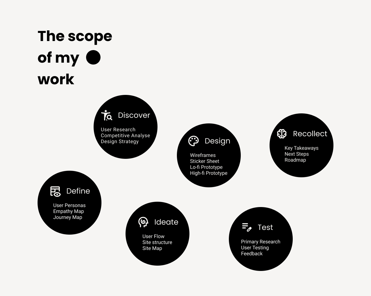
Design Process
Strategic Approach
Rather than adding accessibility features to a broken foundation, I redesigned the entire
user experience around accessibility-first principles while improving usability for all users.

Prototype

Testing and Key Design Decisions
Testing Phase: A Learning Experience
Initial Testing Approach (What I Did)
I conducted usability testing with 5 users with diverse accessibility needs, using the following task structure:
- "Navigate to the Audio Tour menu and start an audio tour for a chosen exhibit"
- "Access the accessibility menu and adjust at least one setting"
Results from This Approach:
Users successfully completed all tasks with minimal difficulty. Feedback included comments like "easy to navigate," "intuitive," and suggestions for "more customization." Overall, the testing seemed to validate the design decisions.
Critical Reflection: What Went Wrong
- Challenge 1: Testing Interface Compliance, Not User Experience
- Challenge 2: Leading Users to Solutions
- Challenge 3: Artificial Task Structure
- Challenge 4: Shallow Success Metrics
What I did: Created step-by-step instructions that essentially tested if users could follow directions
The issue: This doesn't reveal how users would naturally interact with the app or whether the design truly meets their needs
What I did: Told users exactly where to go ("Navigate to the Audio Tour menu")
The issue: I prevented discovery of potential navigation problems and didn't test whether features are findable when needed
What I did: Created testing scenarios that don't mirror real-world usage
The issue: Users don't think "I want to access the accessibility menu" - they think "I need this text to be bigger"
What I did: Measured task completion rather than understanding user mental models
The issue: 100% task completion told me nothing about actual usability
Better Task Example:
- Original: "Navigate to the Audio Tour menu and start an audio tour"
- Improved: "You want to enhance your museum experience. Explore what options are available."
This tests natural discovery and value perception rather than button-clicking ability.
Key Learnings & Future Approach
What I learned: Good UX research should challenge assumptions, not validate them. Users don't think about interfaces—they think about goals.
How I'd approach it differently:
- Conduct proper user research using scenario-based tasks
- Test in realistic contexts (ideally at the museum)
- Focus on emotional experience not just task completion
- Iterate based on real insights rather than interface feedback
- Validate with accessibility experts and actual users with diverse needs
Professional Growth Reflection
What This Experience Taught Me:
- Self-awareness: Recognizing flawed methodology independently
- User empathy: Understanding real user behavior vs. designer assumptions
- Growth mindset: Learning from mistakes strengthens UX thinking
Recognizing and correcting methodological flaws demonstrates stronger UX thinking than achieving perfect results from poor testing. Moving forward, I prioritize research methods that challenge my assumptions rather than validate them, leading to truly user-centered solutions. This reflective process has proven more valuable for my professional development than any 'successful' test results could have been.
Results: Key Design Decisions
1. Integrated Accessibility Hub
Problem: No accessibility features were available
Solution: Floating accessibility overlay accessible from any screen with comprehensive options:
- Font size adjustment (3 levels)
- High contrast and color inversion
- Dyslexia-friendly font toggle
- Audio guide and text-to-speech
- AR wayfinding and note-taking
2. Persistent Bottom Navigation
Problem: Users previously couldn't understand where they were in the app
Solution: Clear, persistent navigation with logical grouping (Explore, Scan QR, Info, Listen)
Impact: Always-visible navigation reduces cognitive load and provides consistent orientation
3. Overlay Design Pattern
Problem: Accessibility features typically buried in settings
Solution: Floating accessibility menu that overlays content, accessible via prominent button
Impact: Users can access accessibility tools without losing their place in the app
Design System
To ensure consistent accessibility and usability throughout the app, I developed a comprehensive design system built on accessibility-first principles. The system established a structured typography hierarchy featuring dyslexia-friendly font options, alongside a high-contrast color palette that exceeds WCAG AA standards. This foundational framework enabled seamless implementation of the integrated accessibility hub and persistent navigation elements, ensuring all interface components maintained visual consistency while supporting the app's accessibility-focused architecture.
Impact and Business Value
Immediate Benefits
Universal Usability
All users benefit from clearer navigation and better organization
Market Access
First museum app with comprehensive accessibility features
Competitive Advantage
Access to €13.2 billion European disability tourism market
Projected Impact
Visitor Increase
Potential increase in visitors with disabilities
Market Potential
European disability tourism market size
Key Takeaways
Final flow
Future Roadmap

Conclusion
This project transformed a personal frustration into a comprehensive solution addressing a €13.2 billion market opportunity. By redesigning with accessibility-first principles, I created an experience that serves visitors with disabilities while improving usability for all users - proving that inclusive design is both the right thing to do and smart business strategy.